The Problem with YouTube and Oversaturated Thumbnails
3 min read
YouTube is one of the most popular platforms for videos today. Whether you’re looking for how-to tutorials, vlogs, or just some fun content, YouTube has it all. But there’s one thing viewers and creators often talk about: thumbnails. These are the small images that show up before you click on a video. And lately, a lot of these thumbnails have become super bright and oversaturated.
Let’s find out why this is happening and whether it’s a good thing.
Why Thumbnails Matter on YouTube

Thumbnails are like the cover of a book—they help us decide if we want to watch a video. A good thumbnail grabs our attention and makes us curious. YouTube uses a measurement called CTR (Click-Through Rate).
This tells how many people clicked on a video after seeing the thumbnail. The more clicks, the more YouTube promotes that video. That’s why thumbnails are so important!
What Are Oversaturated Thumbnails?
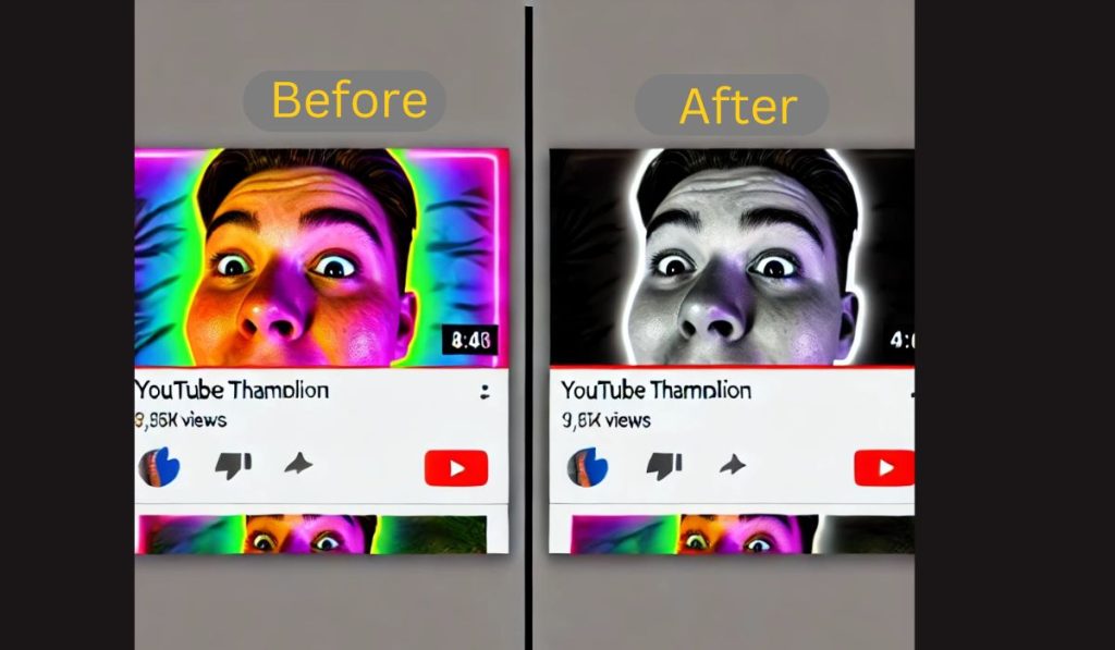
Oversaturated thumbnails are images with extra bright colors, sharp contrasts, and often exaggerated facial expressions. You might notice these thumbnails have glowing reds, bright yellows, and even neon greens. They seem to jump off the screen because they’re designed to catch your eye quickly.
Why Are Creators Using Oversaturated Thumbnails?
As YouTube grew, competition between creators got stronger. Everyone wanted their videos to stand out, so they started using bold, bright thumbnails. It worked—for a while. These thumbnails got more clicks because they were hard to ignore. Big YouTubers like vloggers and gamers led this trend, and soon, it spread across the platform.
The Problem with Oversaturation
At first, bright, colorful thumbnails seemed like a great idea. But now, many viewers are getting tired of them. Here’s why:
- Viewer Fatigue: After seeing so many similar thumbnails, people might start to ignore them. When everything is super bright, nothing stands out anymore.
- Misleading Thumbnails: Sometimes, these thumbnails don’t match the video’s content. This makes viewers feel tricked, leading them to trust the creator less.
- Hurting the Algorithm: If people click on a video but leave right away because the thumbnail didn’t match the content, YouTube notices. This can hurt the video’s performance and make it harder for creators to grow their channels.
Better Ways to Make Thumbnails

Not every successful YouTuber uses oversaturated thumbnails. Here are some tips to create effective and engaging thumbnails without going overboard:
- Keep It Simple: Use clean and clear images that reflect what the video is about. Sometimes, less is more.
- Consistency: If you have a specific style for your channel, stick to it! Consistent branding builds trust and helps viewers recognize your content.
- Show Real Emotion: Instead of exaggerating, show real reactions or images that match the mood of your video.
How to Stand Out on YouTube
It’s possible to stand out without making thumbnails too flashy. The key is to be authentic and offer something valuable. Viewers are looking for content that feels genuine. If your thumbnail matches your video, people will come back for more. Staying true to your style will help you grow a loyal audience.
Conclusion
Oversaturated thumbnails might grab attention at first, but they can also cause problems in the long run. Viewers can get tired of them, and creators might lose their trust if the video doesn’t match the thumbnail. A simple, consistent style often works better, especially when it aligns with the video’s content.
Do you think oversaturated thumbnails are here to stay, or are they just a trend? Share your thoughts in the comments, and don’t forget to subscribe for more helpful tips!


