What are the key elements to include in a double-sided brochure?
4 min read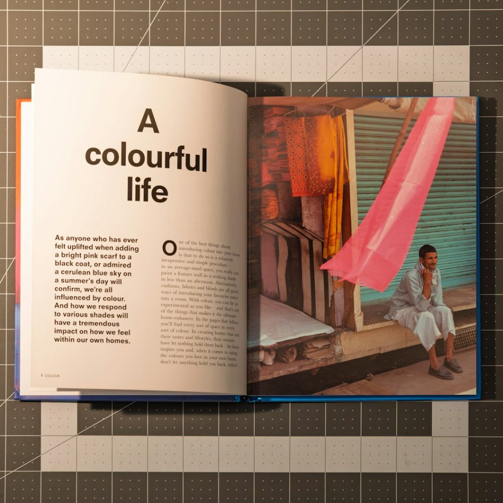
Creating an effective double-sided brochure is an essential part of marketing for businesses, events, and organizations. Whether distributed in-store, at events, or mailed directly to potential customers, a brochure can inform, persuade, and drive action. To maximize the impact of a double-sided brochure, designers must consider both aesthetic and content elements that engage the reader and clearly communicate the key message.
Key Elements to Include in a Double-Sided Brochure
1. Clear Purpose and Objective
The first step in designing any brochure is understanding its objective. Is it to promote a product, explain a service, or invite readers to an event? The content should support this purpose from start to finish. Each side of the brochure should work together to tell a cohesive story, but with distinct roles. For example, one side might provide an overview while the back goes into details and includes contact information.
2. Eye-Catching Cover Design
The front cover is the first thing a reader will see, so it should be visually appealing and immediately grab attention. This includes using high-quality graphics, strategic color use, and compelling headlines or taglines. Make sure the title or central theme of the brochure is clearly laid out.
3. Logical Layout and Organization
A good brochure design leads the reader through the content seamlessly. Use headings, subheadings, bullets, and numbered lists to boost readability. Organize the content so it naturally flows from one section to the next, guiding the reader with visual cues and consistent design language.
4. Concise Yet Informative Content
Brevity is key in a brochure. Use short paragraphs, bullet points, and strong headers to convey information quickly. Avoid overwhelming the reader with too much text. Instead, focus on key selling points, benefits, and unique features. On the front side, use content that piques curiosity, and on the back, provide in-depth details or FAQs.
5. Compelling Call-to-Action (CTA)
Every brochure should include a clear and motivating call-to-action. Whether it’s “Call us today,” “Visit our website,” or “Register now,” the CTA should stand out visually and direct the reader toward a next step. It’s usually placed on the back or bottom of the brochure, where readers finish engaging with the content.
6. Brand Identity Integration
Consistent branding builds credibility and helps the brochure support a company’s larger marketing efforts. Use your company’s logo, color scheme, font choices, and tone of voice throughout the design.
Even subtle brand elements such as pattern usage, icon style, and imagery should align with your established branding.
7. Contact Information and Location Details
Don’t let your message go to waste—ensure readers know exactly how to reach out. Include a phone number, email address, website, and physical location if relevant. QR codes can also be an effective, interactive way to link readers to your digital content or landing pages.
8. Engaging Visuals and Graphics
Visual storytelling boosts engagement significantly. Make use of relevant and high-quality images to break up text and support your message. Infographics, charts, and illustrations can also help explain complex details quickly and clearly.

9. Quality Printing and Paper Choice
Presentation matters. Choose a quality printing service and paper type that matches the tone and purpose of your brochure. Heavier paper with a matte or glossy finish can give a professional feel and increase durability, especially for longer-term use.
10. Back Side: Reinforcement and Conversion
The back side of a double-sided brochure should do more than replicate the front—it should deepen engagement. Use it for:
- Testimonials or quotes
- Details about services or products
- Special offers or promotions
- Social media handles or links
FAQ
Q1: What size should a double-sided brochure be?
Common sizes include 8.5″ x 11″ tri-fold, 8.5″ x 5.5″ half-fold, and custom sizes depending on printing needs. The layout should be considered during the design stage to accommodate folds and margins.
Q2: Can I use both sides for text-heavy content?
Yes, but it’s important to balance text with visuals and white space. Avoid overwhelming the reader; instead, aim for digestible sections and calls-to-action.
Q3: Is color printing necessary for brochures?
Color printing is highly recommended for marketing brochures. It enhances visual appeal and improves engagement, although black-and-white can work for minimalist or budget-conscious campaigns.
Q4: Should I include pricing on my brochure?
It depends on the intent of your brochure. For promotional materials, including prices can be helpful. However, for more general brand-focused brochures, you may want to direct readers to your website or sales team for pricing.
Q5: How do I make the brochure accessible?
Use high-contrast color schemes, legible fonts, and left-aligned text. Also, consider providing a digital, screen-reader-friendly version of the brochure for wider accessibility.