Invisible Design Ux: The Art of Subtle Interfaces
5 min read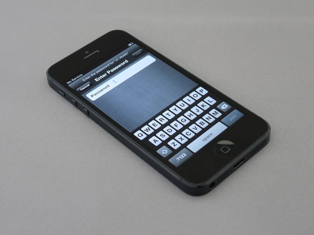
In a world overflowing with flashy buttons, sliding menus, and attention-grabbing graphics, the art of subtle interface design often goes unnoticed. Yet, it’s precisely this *”invisibility”* that makes certain user experiences so fluid and delightful. Invisible design in UX (User Experience) refers to interfaces so intuitive and natural that users barely notice they’re interacting with a design at all.
TL;DR
Invisible design is about crafting digital experiences that flow seamlessly, allowing users to focus on their goals rather than the interface itself. It relies on natural interactions, familiar patterns, and effective content hierarchy. This design philosophy enhances usability by minimizing cognitive load. Successful invisible design feels like second nature and is a hallmark of mature, user-centric UX strategy.
What Is Invisible Design in UX?
Invisible design isn’t about literal invisibility—it’s about minimizing the perceived interface so the user can concentrate wholly on completing their task. It emphasizes function over flare, where every pixel has a purpose. The best interfaces don’t distract; they fade into the background.
This concept stems from the broader principle in user experience design that the best interface is no interface. While this may sound extreme, the goal is clear: reduce unnecessary complexity to let users glide through their experience effortlessly.
Core Principles of Invisible Design
To achieve a subtle, effective user interface, designers lean on several foundational principles:
- Consistency: Familiar patterns and UI conventions reduce the learning curve for users.
- Simplicity: Keeping interactions minimal and intuitive lowers cognitive burden.
- Feedback: Subtle cues reassure users that they’re on the right track (like animations, microinteractions, and color shifts).
- Prioritizing content: Good invisible design lets users interact with content, not controls.
- Progressive disclosure: Only show information or options when necessary to avoid overwhelming users.
Examples of Invisible Design in Action
Many successful companies rely on invisible design to guide users in elegant ways:
- Google Search: The humble search bar is an iconic example. No buttons or introductions required—just type and go.
- Airbnb: The interface subtly leads users from browsing to booking using minimal instructions and highly visual, intuitive layouts.
- Apple’s iOS: Gestures like swiping, pinching, or long-pressing create interaction without visual clutter.

Designing for Subtlety: Components of an Invisible UI
Smart interface designers consider multiple components when aiming for an invisible experience:
1. Information Architecture
The structure of information should be clear enough that users instinctively know where to go next, often achieved through well-thought-out hierarchy and labeling.
2. Microinteractions
These are the slight visual or auditory cues—like a button bounce or a ping tone—that provide user feedback. When done subtly, they enhance trust and usability.
3. Content-First Design
Invisible design often means minimizing the visual footprint of controls and letting text, images, and media become the focal points of interaction.
4. Responsive and Adaptive Layouts
Invisible design must work across all devices. Fluid transitions between devices and screen sizes reduce friction and preserve the design’s subtlety.
5. User Empowerment
Design should feel empowering—giving users control without requiring extensive explanations or guidance. When users feel competent, the design has done its job.
Benefits of Invisible Design
While it may not always be flashy, invisible design comes with real advantages:
- Higher usability: Users accomplish tasks faster because controls feel intuitive.
- Better accessibility: Simplified, content-centric design tends to be more accessible to users with various needs.
- Lower learning curve: Reusing familiar conventions ensures even new users can navigate comfortably.
- Cleaner visuals: Less UI clutter allows content to shine.
Challenges of Going Invisible
Of course, designing for subtlety isn’t without its pitfalls. When done poorly, invisible interfaces can lead to confusion and disorientation.
- Ambiguity: Hiding too much can leave users unsure of what actions are possible.
- Lack of discoverability: Without cues or guidance, crucial features might go unnoticed.
- Overreliance on gestures or conventions: Some users may not be familiar with certain idioms or metaphors, especially in mobile design.
It’s a delicate balance—invisible should never mean inscrutable.
When Should Invisible UX Be Applied?
Invisible UX works especially well in environments where the user’s goal is clear and where guidance would be otherwise redundant or patronizing:
- Productivity tools: Minimizing interface allows users to focus on their tasks—writing, editing, designing.
- Streaming apps: The goal is viewing content, not managing controls. Invisible design gets out of the way.
- Search-driven apps: Like Google or Spotify, where input and results should dominate, not a complex navigation system.
Tips for Implementing Invisible Design
For teams looking to incorporate invisible design into their products, consider the following strategies:
- Start with the user’s goal: Prioritize the outcome over the bells and whistles.
- Use user testing: Watch how real people interact with your interface to locate points of friction.
- Simplify navigation: One clear action per screen often trumps choice-heavy interfaces.
- Rely on familiarity: Don’t reinvent interaction models unless you have a compelling reason.
The Future of Invisible Design
The rise of AI, voice interfaces, and ambient computing is accelerating the trend toward invisible UX. Users now interact through voice commands, headless apps, and predictive systems without needing to “see” a screen at all.
As interfaces become more context-aware—anticipating needs rather than responding to clicks—the line between interface and experience blurs even further.

Conclusion
Invisible design is not the absence of design but rather the culmination of good design. It creates a seamless, distraction-free space where users can engage with content and experiences effortlessly. Designers looking to create more intuitive products must learn the subtle balance between simplicity, familiarity, and clarity to let their designs *disappear* in the best way possible.
Frequently Asked Questions (FAQ)
What is invisible design in UX?
Invisible design is a user experience approach where the interface is so intuitive and minimal that users aren’t even aware of it. It creates a seamless interaction where design elements recede into the background and content or tasks take center stage.
Is invisible design suitable for all types of applications?
Not always. While it works well for focused, action-oriented experiences like search tools, productivity apps, and content consumption platforms, applications that require complex workflows or user onboarding may need more visible guidance.
How does invisible design improve user experience?
It reduces clutter, minimizes the learning curve, and helps users achieve their goals more efficiently. By removing distractions, it creates a frictionless path to success.
How can designers test the effectiveness of an invisible UI?
Through usability testing and user observation. If users can complete tasks without asking questions or encountering hesitation, the design is likely effective. Heatmaps, click tracking, and in-app analytics also provide valuable insights.
Are there specific tools to help create invisible designs?
While most design tools (like Figma, Sketch, or Adobe XD) can be used to create any type of interface, the real asset is a solid understanding of UX principles, user psychology, and simplicity-focused design thinking.